Hospital Farmshed Analysis
Comprehensive Methodology Documentation v2.0
1. Project Purpose and Motivation
The goal of this project is to create a national farmshed map that identifies areas with the highest potential for locally sourcing food. While the current application focuses on hospitals as anchor institutions, the underlying methodology produces a generalizable assessment of local food system strength that could serve commercial, institutional, or individual use cases.
1.1 The Core Question
This analysis attempts to answer: "Which areas have the highest potential for locally sourcing their food?" It does not attempt to determine whether local sourcing is actually possible in any given area—that would require detailed supply-and-demand modeling, economic feasibility analysis, and infrastructure assessment. Instead, this methodology identifies areas where the conditions are most favorable relative to other areas, based on four measurable dimensions of agricultural capacity.
1.2 The Unit of Analysis: Census Block Groups
All metrics are computed at the Census block group level—the smallest geographic unit for which the Census Bureau publishes sample data. Block groups typically contain between 600 and 3,000 people, though sizes vary significantly:
- Urban block groups: Often less than 0.5 km² (0.2 mi²), densely populated
- Suburban block groups: Typically 1-10 km² (0.4-4 mi²)
- Rural block groups: Can exceed 100 km² (40 mi²), especially in Western states
Because block groups vary so much in size, and because food accessibility realistically extends beyond any single block group's boundaries, all metrics incorporate a neighborhood-aware calculation. For each block group, we calculate its own metric value and add a weighted contribution (50%) from neighboring block groups within an 8 km (5 mile) buffer. This captures the reality that farms, markets, and distribution infrastructure in adjacent areas contribute to a location's food access.
1.3 Agricultural Variability Across the United States
Agricultural land use varies dramatically across states. According to USDA data, 39% of U.S. land area is used by farms, totaling 876 million acres—but this national average masks enormous regional variation:
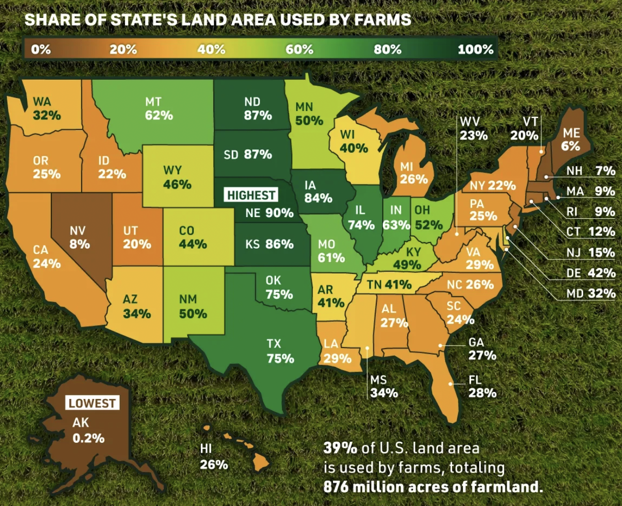
The Midwest and Great Plains states have the highest agricultural land use:
- Nebraska (90%), South Dakota (87%), North Dakota (87%), Kansas (86%), Iowa (84%)
- These states are dominated by field corn, soybeans, and wheat—primarily feed and commodity crops
In contrast, the Northeast states this analysis currently covers have much lower agricultural intensity:
- Vermont (20%), Massachusetts (9%), New Hampshire (7%), Maine (6%)
- New York (22%), Pennsylvania (25%), New Jersey (15%), Connecticut (12%), Rhode Island (9%)
This variation is critical for interpreting farmshed scores. A "high" score in Massachusetts reflects strong local food potential relative to that state's agricultural context, but the absolute agricultural capacity is much lower than a "medium" score in Iowa. This is why the methodology provides both state-level normalization (relative ranking within state) and national-level normalization (absolute comparison across states).
2. The Four Farmshed Dimensions
The farmshed score combines four dimensions that capture different aspects of local food system strength:
- Scale (30% weight): Total acreage of human food cropland—a proxy for agricultural production capacity
- Diversity (30% weight): Variety of food products available—important for nutritional completeness and menu planning
- Quality (20% weight): Density of organic and regenerative farms—alignment with sustainability goals
- Accessibility (20% weight): Density of CSAs and farmers markets—existing distribution infrastructure
2.1 Scale: Measuring Agricultural Production Capacity
Using the USDA Cropland Data Layer (CDL), a national land cover dataset updated annually at 30-meter resolution, we capture the scale of agriculture in each area. The CDL classifies approximately 250 crop and land cover types across the continental United States.
The CDL is first filtered to include only crops primarily grown for direct human consumption—excluding field corn (95% goes to animal feed and ethanol), soybeans (primarily oil and feed), cotton, hay, and pasture. The remaining raster is then vectorized to calculate total acreage of human food cropland.
This metric is supplemented by OpenStreetMap (OSM) farm polygons tagged as farmland, orchards, or vineyards, capturing community-mapped agricultural areas that may be missing from the satellite-derived CDL.
Why it matters: Scale serves as a proxy for current agricultural production in an area. Without sufficient productive capacity, local food sourcing cannot occur at institutional scale. The density of farmland reflects the agricultural heritage and current land use patterns of a region.
Human Food Crops Included (76 crop codes):
The following CDL crop categories are classified as human food crops:
Vegetables: Dry Beans, Potatoes, Sweet Potatoes, Mixed Vegetables & Fruits, Watermelons, Onions, Cucumbers, Peas, Tomatoes, Caneberries, Herbs, Carrots, Asparagus, Garlic, Cantaloupes, Honeydew Melons, Broccoli, Peppers, Greens, Strawberries, Squash, Lettuce, Pumpkins, Cabbage, Cauliflower, Celery, Radishes, Turnips, Eggplants, Gourds
Fruits & Nuts: Cherries, Peaches, Apples, Grapes, Other Tree Crops, Citrus, Pecans, Almonds, Walnuts, Pears, Pistachios, Prunes, Olives, Oranges, Avocados, Nectarines, Plums, Apricots, Blueberries, Cranberries
Grains for Human Consumption: Rice, Barley, Durum Wheat, Spring Wheat, Winter Wheat, Rye, Oats, Millet, Buckwheat, Quinoa, Amaranth
Legumes: Peanuts, Chickpeas, Lentils
Specialty: Sweet Corn, Mint, Hops, Aquaculture
Excluded (primarily feed/industrial): Field Corn, Soybeans, Sorghum, Alfalfa, Hay, Cotton, Sugarbeets, Tobacco, Christmas Trees, and all pasture/fallow/developed land cover classes.
2.2 Diversity: Measuring Product Variety
Diversity counts the number of unique food products available from farms in each area. This combines product lists from farm point data (LocalHarvest, Rodale Institute, regenerative farm databases) with crop types identified from CDL polygons.
Products are deduplicated so that "tomatoes" from three different farms counts as one unique product. This measures the variety of what's available, not the quantity.
Why it matters: A diverse local food system can support varied institutional menus and nutritional needs. An area with only apple orchards scores lower on diversity than an area with vegetables, fruits, grains, and dairy—even if total acreage is similar.
2.3 Quality: Measuring Sustainable Production Practices
Quality measures the density of farms using certified organic or regenerative agricultural practices. Data sources include the USDA Organic Integrity Database, Rodale Institute's organic farm database, and self-reported regenerative farms.
This uses point-counting methodology: each organic or regenerative operation is counted equally regardless of size. A 1-acre organic farm counts the same as a 100-acre operation. This reflects the value of sustainable practices at any scale for local food access and environmental goals.
Why it matters: Hospitals and institutions increasingly have sustainability mandates. The presence of certified organic and regenerative farms indicates a local food system aligned with health and environmental missions.
2.4 Accessibility: Measuring Distribution Infrastructure
Accessibility counts CSA (Community Supported Agriculture) operations and farmers markets—direct-to-consumer distribution channels that make local food accessible to institutions and individuals.
Operations offering both CSA and market sales are deduplicated (counted once). This measures the density of distribution points, not production capacity.
Why it matters: A farm can be organic but not offer CSA or market sales. Accessibility captures the distribution infrastructure that connects producers to consumers. Without existing distribution channels, local food sourcing requires building new supply chains.
3. Technical Methodology
3.1 Neighbor-Aware Scoring
Because food accessibility extends beyond block group boundaries, each metric incorporates neighboring areas. For each block group i:
Neighbor-Aware Value Calculation
\[ \text{Metric}_i^{\text{neighbor}} = \text{Metric}_i^{\text{focal}} + 0.5 \times \text{Mean}(\text{Neighbor Metrics}) \]Where neighbors are all block groups whose centroids fall within an 8 km (5 mile) buffer around block group i's centroid.
Interpretation: Each block group's score is 100% of its own value plus 50% of the average value from surrounding areas. This acknowledges that nearby agricultural resources contribute to local food access.
3.2 Normalization Approaches
State-Level Normalization (Relative)
State-normalized scores rank block groups within their own state. A score of 75 means "better than 75% of block groups in this state."
Scale, Quality, Accessibility (Percentile-Based)
\[ \text{Score}_{\text{state}} = \text{PercentileRank}(\text{raw value}) \times 100 \]Diversity (Log-Scaled)
\[ \text{Score}_{\text{state}} = \frac{\ln(1 + \text{raw value})}{\ln(1 + \text{max}_{\text{state}})} \times 100 \]Log scaling is used for diversity because product counts follow a power-law distribution (few block groups have >50 products).
National-Level Normalization (Absolute)
National-normalized scores use fixed caps derived from analysis across all processed states. These caps represent the 95th percentile of maximum values observed:
| Dimension | National Cap | Unit | Interpretation |
|---|---|---|---|
| Scale | 2,347.63 | acres | Score of 100 = 2,348+ acres human food crops in buffer |
| Diversity | 109.53 | products | Score of 100 = 110+ unique products in buffer |
| Quality | 5.83 | farms/km² | Score of 100 = 5.83+ organic/regen farms per km² |
| Accessibility | 8.89 | points/km² | Score of 100 = 8.89+ CSA/market points per km² |
National Normalization Formula
\[ \text{Score}_{\text{national}} = \min\left(\frac{\text{raw value}}{\text{cap}} \times 100, \; 100\right) \]Values exceeding the cap are clipped to 100.
Key Assumption: This approach assumes the caps represent "achievable" levels of local food capacity. This is a strong assumption—it implies that a score of 50 represents half the capacity of the most agriculturally productive areas. Whether this linear interpretation is meaningful for actual food sourcing feasibility is an open question.
3.3 Population Adjustment
Raw agricultural metrics don't account for demand. An area with high farm density but very high population may have less per-capita access than a rural area with moderate farms but few people. The population adjustment creates a ratio of "farm capacity to population demand."
Step 1: Normalize Population Density
\[ \text{pop\_norm} = \text{clip}\left(\frac{\log_{10}(\text{pop\_density}+1)}{4.5}, \; 0, \; 1\right) \]Using log₁₀ with divisor 4.5 means population densities of approximately 31,600 people/km² max out the scale at 1.0. This accommodates dense urban cores (Manhattan: ~27,000/km²) while still differentiating suburban and rural areas.
Step 2: Compute Farm-to-Population Ratio
\[ \text{farm\_norm} = \frac{\text{Base Farmshed Score}}{100} \] \[ \text{ratio} = \begin{cases} \infty & \text{if } \text{pop\_norm}=0 \\[6pt] \frac{\text{farm\_norm}}{\text{pop\_norm}} & \text{otherwise} \end{cases} \]Step 3: Apply Adjustment Factor
| Ratio Range | Adjustment Factor | Interpretation |
|---|---|---|
| ≥ 2.0 | 1.00 (no penalty) | Plenty of farm capacity for population |
| [1.0, 2.0) | 0.90 – 1.00 | Adequate capacity |
| [0.5, 1.0) | 0.70 – 0.90 | Moderate capacity relative to demand |
| [0.2, 0.5) | 0.50 – 0.70 | Limited capacity for population |
| < 0.2 | 0.30 – 0.50 | Insufficient capacity for population |
Final Score
\[ \text{Farmshed\_Score} = \text{Base Score} \times \text{Adjustment Factor} \]4. Combined Farmshed Score
The combined score integrates all four dimensions using weighted averaging:
Weighted Average (Base Score)
$$ \begin{aligned} \text{Base Farmshed} = &\; 0.30 \times \text{Scale\_Score} \\ &+ 0.30 \times \text{Diversity\_Score} \\ &+ 0.20 \times \text{Quality\_Score} \\ &+ 0.20 \times \text{Accessibility\_Score} \end{aligned} $$After population adjustment, the final score range is 0-100.
4.1 Weighting Rationale
| Dimension | Weight | Justification |
|---|---|---|
| Scale | 30% | Production capacity is fundamental—without sufficient acreage, institutional-scale sourcing isn't possible |
| Diversity | 30% | Product variety enables menu planning and nutritional completeness for hospital food service |
| Quality | 20% | Organic/regenerative farms align with hospital sustainability and health missions |
| Accessibility | 20% | CSA/market infrastructure demonstrates existing local distribution networks |
4.2 Score Categories
- High (≥85): Strong combined capacity even after population adjustment
- Medium-High (70–84): Above-average capacity and/or supportive population balance
- Medium (50–69): Moderate farmshed strength
- Medium-Low (30–49): Limited strength or higher population pressure
- Low (10–29): Sparse farmshed relative to population
- None (<10): Very limited local food capacity
5. Interpreting the Results
5.1 State vs. National: Two Different Questions
State-Normalized Scores Answer:
"Within this state, which areas are best positioned for local food sourcing?"
This is a relative comparison. A score of 80 means "top 20% within this state" but says nothing about absolute capacity. Use state scores when comparing hospitals within a single state or identifying regional patterns.
National-Normalized Scores Answer:
"Compared to the most agricultural areas in the country, how does this area rank?"
This is an absolute comparison. A score of 80 means the area has 80% of the agricultural capacity of the highest-producing regions nationwide. Use national scores when comparing across state boundaries or assessing absolute potential.
5.2 What These Scores Do NOT Tell You
- Not a feasibility assessment: High scores don't guarantee that local sourcing is economically viable or logistically practical
- No supply-demand matching: The scores don't account for whether local production matches institutional demand (volume, timing, specific products needed)
- No economic factors: Pricing, contracts, transportation costs, and cold chain infrastructure are not modeled
- Static snapshot: Agricultural capacity varies seasonally and year-to-year; this represents one point in time
- Data completeness varies: Some farms don't appear in any database; urban agriculture is underrepresented
5.3 Appropriate Use Cases
- Identifying hospitals with strong local sourcing potential for further investigation
- Prioritizing investments in local food infrastructure
- Understanding regional patterns in agricultural capacity
- Policy planning for farm-to-institution programs
- Research on food systems geography
- Definitive claims about food availability or sourcing feasibility
- Legal determinations of "local food" compliance
- Replacement for direct farm surveys or market analysis
- Guarantee of supply chain viability without further validation
6. Paths Toward Validation
A fundamental challenge with this methodology is that the national caps—while derived from cross-state analysis—are still internal to this dataset. The 95th percentile values represent the upper range of what we observed, not an externally validated threshold for "local sourcing is feasible here." Without ground truth validation, the scores remain sophisticated rankings rather than predictive assessments.
This section outlines potential approaches to validate the farmshed index against real-world outcomes. These represent future research directions rather than completed work.
6.1 Hospital Local Sourcing Surveys
Approach: Identify hospitals that currently source food locally and test whether they have higher farmshed scores than hospitals that don't.
Potential data sources:
- Health Care Without Harm / Practice Greenhealth member hospitals report sustainable food purchasing metrics
- State farm-to-institution programs often track participating hospitals
- Hospital sustainability reports from larger health systems
- Direct surveys of hospital food service directors about local sourcing percentages and barriers
Test: Do hospitals reporting high local sourcing percentages cluster in high-farmshed-score areas?
Limitation: Selection bias is a concern—hospitals that actively source locally may have helped create the local food infrastructure (CSAs, farmers markets) that the index measures. Cause and effect may be entangled.
6.2 Expert and Practitioner Validation
Approach: Interview food service directors at hospitals across the score spectrum to assess face validity.
Sample questions:
- "What percentage of your food budget comes from local sources (within 250 miles)?"
- "What are your biggest barriers to increasing local sourcing?"
- "Looking at this score for your hospital's area, does it match your intuition about local food availability?"
Value: Qualitative insights could reveal where the index succeeds, where it fails, and what dimensions might be missing (e.g., cold chain infrastructure, distributor relationships, seasonal availability).
6.3 Supply-Demand Feasibility Modeling
Approach: Work backward from actual hospital food demand to test whether local supply could theoretically meet it.
Method:
- Estimate typical food volume needs for hospitals by bed count (e.g., pounds of produce per week)
- Calculate theoretical production capacity of farms within a defined radius (50-100 miles)
- Compare supply capacity to demand and correlate with farmshed scores
Potential finding: "A farmshed score of 60 corresponds to areas where local farms could theoretically supply approximately 40% of a typical hospital's produce needs."
Limitation: This is a significant research undertaking requiring production yield estimates, hospital food service data, and assumptions about what fraction of farm output is available for institutional purchase.
6.4 Correlation with Independent Indicators
Approach: Test whether farmshed scores correlate with independent measures that should relate to local food capacity.
| Independent Indicator | Expected Relationship | Data Source |
|---|---|---|
| USDA Food Desert designation | Negative correlation | USDA Food Access Research Atlas |
| Farmers market count (USDA) | Positive correlation | USDA National Farmers Market Directory |
| Farm-to-school program participation | Positive correlation | USDA Farm to School Census |
| State agricultural output per capita | Positive correlation | USDA NASS state statistics |
| Local food policy council presence | Positive correlation | Food Policy Networks database |
Value: Strong correlations with multiple independent indicators would provide convergent validity—evidence that the index captures something real about local food systems.
6.5 Known Extremes Test
Approach: Verify that the index produces sensible results for areas with known characteristics.
Expected high scores:
- Lancaster County, Pennsylvania (intensive diversified agriculture)
- Hudson Valley, New York (farm-to-table culture, high CSA density)
- Vermont's Champlain Valley (strong local food movement)
- Finger Lakes, New York (diversified fruit and vegetable production)
Expected low scores:
- Dense urban cores far from agricultural land (Manhattan, downtown Boston)
- Industrial/suburban areas with minimal farming
Test: Do these known extremes align with index predictions? Failure to correctly rank obvious cases would indicate fundamental problems with the methodology.
6.6 Implications for Index Interpretation
Until validation studies are completed, we recommend interpreting farmshed scores as a screening and prioritization tool rather than a feasibility assessment:
| Score Range | Recommended Interpretation |
|---|---|
| ≥70 | High priority for investigation. Strong indicators suggest local sourcing may be viable. Direct outreach to farms and food service assessment recommended. |
| 50–69 | Moderate potential. Some local food infrastructure exists. Feasibility depends on specific hospital needs and willingness to develop supplier relationships. |
| 30–49 | Challenging but possible. Limited local capacity may require regional sourcing (100+ miles) or focus on specific product categories. |
| <30 | Structural barriers likely. Local sourcing at scale would require significant infrastructure investment or policy intervention. May still be viable for small-scale pilots or specific products. |
7. Data Sources
7.1 Cropland Data Layer (CDL) 2024
Source: USDA National Agricultural Statistics Service (NASS)
Resolution: 30 meters nationwide; 10 meters in select states
Classification: ~250 crop and land cover classes
CRS: NAD83 Conus Albers (EPSG:5070)
Use: Scale dimension (filtered to human food crops) and Diversity dimension (crop type variety)
6.2 Farm Point Databases
Sources:
- LocalHarvest: Web-scraped farm listings with product information, CSA/market flags
- Rodale Institute: Organic farm database via ArcGIS REST service
- USDA Organic Integrity Database: Certified organic operations
- Regenerative farm self-reports: Operations practicing regenerative agriculture
Use: Diversity (product lists), Quality (organic/regenerative flags), Accessibility (CSA/market flags)
6.3 OpenStreetMap Farm Polygons
Tags: landuse=farmland, farmyard, orchard, vineyard
Use: Supplement CDL with community-mapped agricultural areas
6.4 Census Block Groups & Population
Geography: TIGER/Line Shapefiles 2023 (U.S. Census Bureau)
Population: American Community Survey (ACS) 5-Year Estimates, Table B01003_001E (Total Population)
Use: Spatial aggregation unit; population used for demand adjustment
6.5 Hospital Locations
Primary Source: OpenStreetMap via Overpass API
Query Tags: amenity=hospital
Classification: Hospitals are classified by type (general acute, psychiatric, rehabilitation, children's, veterans, etc.) based on OSM tags and name pattern matching
Coverage: Northeast US states (Connecticut, Maine, Massachusetts, New Hampshire, New Jersey, New York, Pennsylvania, Rhode Island, Vermont)
Geocoding: Hospital coordinates come directly from OSM point locations or way/relation centroids
8. Analysis Workflow
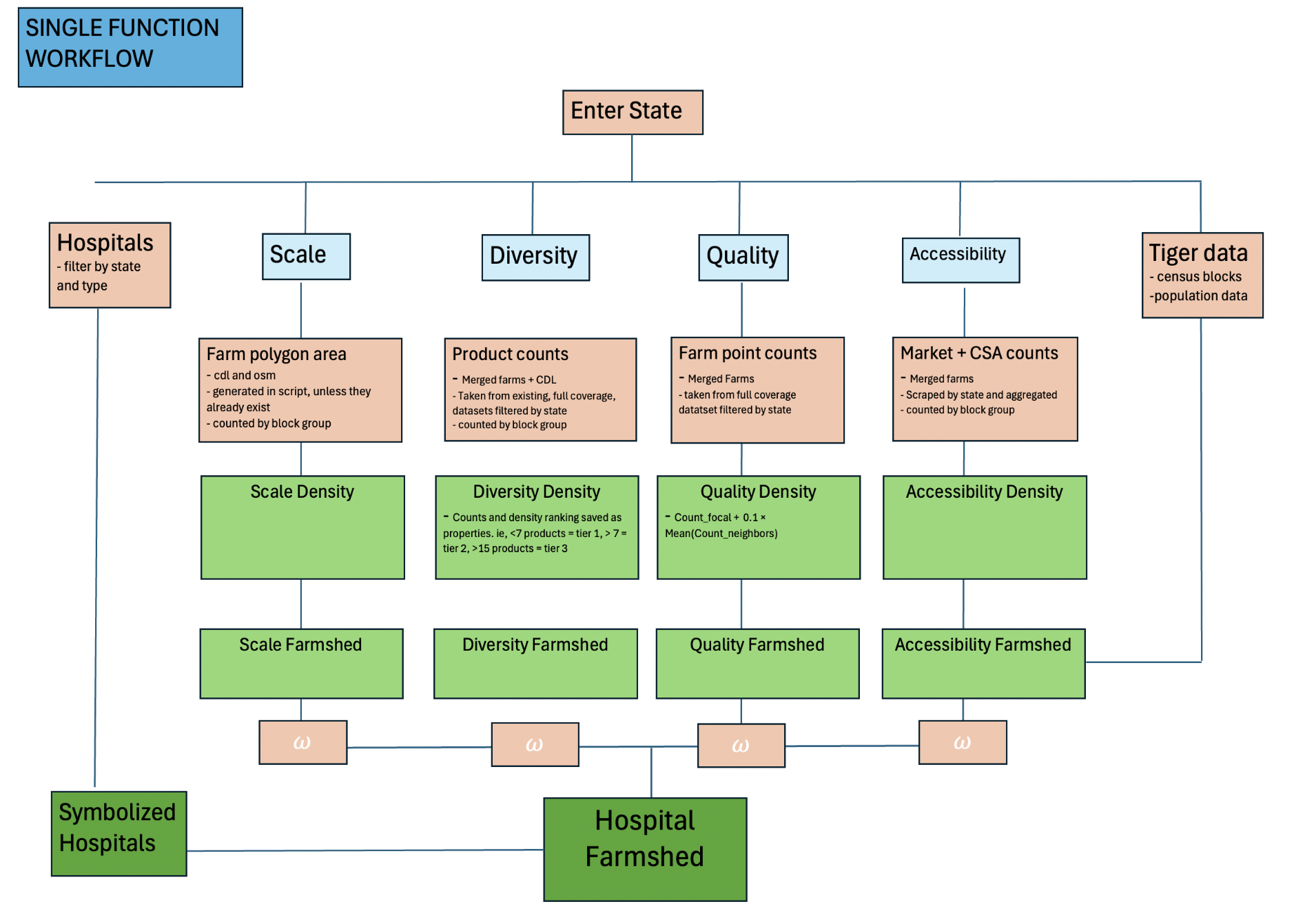
The analysis follows a 12-step pipeline for each state:
- State Boundary: Download TIGER state boundary, clip to target state
- Hospitals: Load OSM hospital points, clip to state
- Block Groups & Population: Download TIGER block groups + ACS population data
- CDL Raster Clipping: Clip national CDL to state extent
- Farm Points: Load merged farm databases (Rodale + LocalHarvest + regenerative)
- Farm Polygons: Vectorize CDL to human food polygons + merge OSM farms
- Scale Dimension: Calculate acreage per block group →
blockgroup_scale.geojson - Diversity Dimension: Count unique products per block group →
blockgroup_diversity.geojson - Quality Dimension: Calculate organic/regenerative density →
blockgroup_quality.geojson - Accessibility Dimension: Calculate CSA/market density →
blockgroup_accessibility.geojson - Combined Farmshed: Weighted average + population adjustment →
farmshed_combined.geojson - Hospital Assignment: Spatial join hospitals to block groups →
hospitals_with_farmshed.geojson
python scripts/build_state_farmshed_v2.py --state-fips 25 --state-name massachusetts9. Technical Implementation
9.1 Software Stack
- Python 3.9+ – Core processing
- GeoPandas 0.14+ – Vector data manipulation
- Rasterio 1.3+ – CDL raster processing
- NumPy/Pandas – Numerical computations
- Shapely 2.0+ – Geometric operations (buffers, spatial joins)
- SciPy – Percentile ranking (rankdata)
- MapLibre GL JS – Web visualization
9.2 Output Files
All outputs saved to data_out/{state_name}/:
boundary.geojson– State outlinehospitals.geojson– Hospital locationspopulation_density.geojson– Block groups with populationfarm_points_unified.geojson– All farm point datafarm_polygons_human_food.geojson– CDL+OSM filtered for human foodblockgroup_scale.geojson– Scale dimension (0-100)blockgroup_diversity.geojson– Diversity dimension (0-100)blockgroup_quality.geojson– Quality dimension (0-100)blockgroup_accessibility.geojson– Accessibility dimension (0-100)farmshed_combined.geojson– Combined farmshed (0-100)hospitals_with_farmshed.geojson– Final output with all scores
9.3 Geographic Coverage
The pipeline supports any U.S. state. Currently processed states:
| State | FIPS | Hospitals | Notes |
|---|---|---|---|
| Connecticut | 09 | ~30 | Northeast region |
| Maine | 23 | ~35 | Northeast region |
| Massachusetts | 25 | ~66 | Primary case study |
| New Hampshire | 33 | ~25 | Northeast region |
| New Jersey | 34 | ~70 | Northeast region |
| New York | 36 | ~180 | Largest sample |
| Pennsylvania | 42 | ~170 | Agricultural heartland |
| Rhode Island | 44 | ~12 | Smallest state |
| Vermont | 50 | ~15 | Northeast region |
10. References & Resources
10.1 Data Sources
- USDA NASS Cropland Data Layer: nass.usda.gov/Cropland
- LocalHarvest: localharvest.org
- Rodale Institute: rodaleinstitute.org
- USDA Organic Integrity Database: organic.ams.usda.gov
- U.S. Census Bureau TIGER/Line: census.gov
- American Community Survey: census.gov/acs
- OpenStreetMap: openstreetmap.org
10.2 Related Literature
- Peters, C. J., et al. (2016). Mapping potential foodsheds in New York State. Renewable Agriculture and Food Systems, 31(1), 72-84.
- Meter, K. (2011). Mapping the Minnesota food industry. Crossroads Resource Center.
- Martinez, S., et al. (2010). Local food systems: Concepts, impacts, and issues. USDA ERS Report No. 97.
- Born, B., & Purcell, M. (2006). Avoiding the local trap: Scale and food systems in planning research. Journal of Planning Education and Research, 26(2), 195-207.
11. About This Project
This hospital farmshed analysis tool was developed to support research into local food systems, farm-to-institution programs, and regional agricultural capacity. The four-dimensional methodology provides a framework for assessing local food access that accounts for production scale, product diversity, farming practices, and distribution infrastructure.
While primarily designed for hospital food sourcing analysis, the underlying farmshed scores can serve broader applications: commercial food businesses evaluating location decisions, policy makers assessing food system investments, or individuals understanding their local agricultural landscape.
Created by: TyreeSpatial
For questions, collaborations, or custom analyses: contact@tyreespatial.com